The Guerciotti Project, Phase 2: The Not-So Simple Question of Colour
Although it may not seem like it, considerable progress has been made in the bike rebuild. The majority of the time incurred so far has been spent buying a shit ton of beer, web surfing, and driving all over hell’s half acre picking up the wrong bike parts. No wonder Italians drink and swear so much.
In Phase 1, you will recall the frame was prepared for powder coating – a process that involves sandblasting the hell out of the metal to get the old paint off, patching, priming, then coating it with a powder that is then baked at four hundred degrees in a big oven like a big pot roast. Considering my oven isn’t nearly big enough to hold a bicycle – not to mention the fact that I just told you everything I know about powder coating – I knew I would require the services of a professional. Everyone from the hipsters to The Establishment were unanimous in naming Villian Ride Company as the place to go.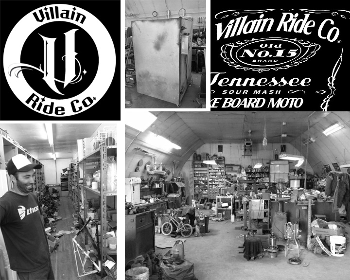 I contacted shop owner Paul Overwater to arrange the procedure. Paul was pleasant and helpful, and told me the process would take 1-2 weeks considering it was his busy season. Of course he hadn’t take in account the fact that it would take me 3-4 weeks to decide what colour I wanted.
Having been a graphic designer for twenty three years (I started when I was eleven) can be both a blessing and a curse. I probably know more than the average bear about colour – a skill far less useful and lucrative than knowing about, say, the inner workings of the human heart – but I also know that there are only a couple of minuscule nanometers between a gorgeous Bianchi celeste and a putrid pastel turquoise à la Miami Vice.
So what, out of the infinite number of choices – both dreadful and divine – would I choose for my precious project bike?
I considered a nice light blue, like this gorgeous Space Horse from All-City Cycle: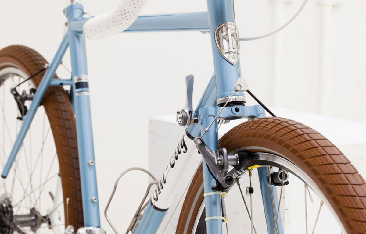 Then one day I happened to be at Parlour Coffee (ok, I’m there most days) and spotted this kindred Guerciotti locked up outside.
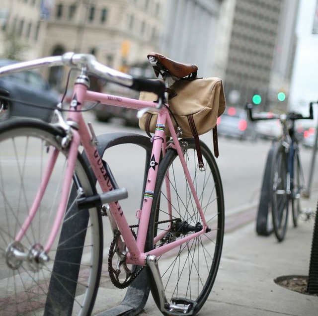 You all know how I feel about pink bikes, but this has to be one of the prettiest bikes I’ve seen. It’s hard to tell from this picture (taken by The Assassin) but there is nothing even remotely Barbie about the colour – it is 100% dead sexy Giro Italian pink.
I seriously considered it, but realized two things:
1) Winnipeg is too small for two dead sexy pink Guerciottis
2) If I had a pink bike I would never hear the end of it
When I stumbled upon this classic original Guerciotti from the VeloClassics blog, I knew I had my colour.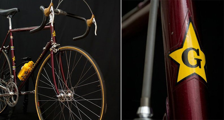 Deep oxblood red – regal, classic, and the colour one of the other true feats of Italian genius: red wine. This would be the perfect colour.
All of this said, I was aware (since Paul Overwater told me) that powder coatings only come in specific colours, so I was keeping my options open. I decided as long as the colour was awesome, I’d be happy. He said he had swatches to choose from, and if there is anything I understand intimately, it is swatches. One of the first things they teach you in design school is that colours don’t have names, crayons do. Computer monitors can vary greatly, and my perception of sky blue may be completely different than yours. The only truly accurate way to pick a colour is by physical sample (swatch) or by number.
I dragged myself and the Guerciotti to the Villain workshop to go about picking a colour and getting the process underway. Paul was super friendly (if a bit camera shy) and led me to the table o’ swatches.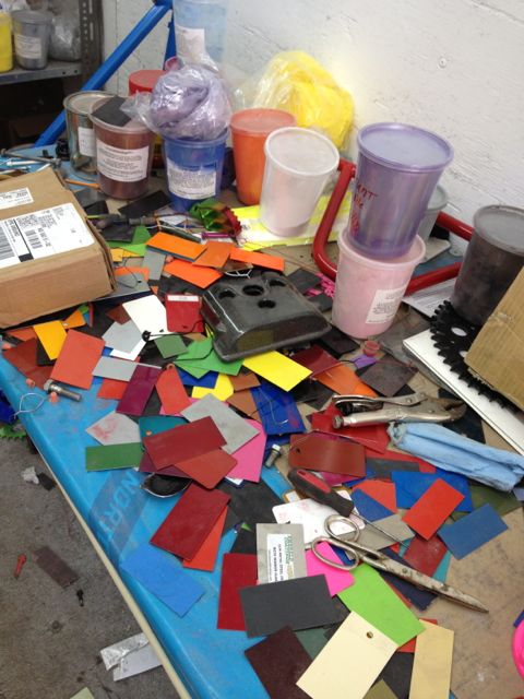 I don’t know if it was the designer in me, or the anal retentive mother, but it took everything I had not to pull up a chair and organize the table of swatches by colour families, hues, tints and shades. Instead, I rifled through the colours and tried to find something I liked. Coming up empty, my only option was to pick something from the powder manufacturers website. On screen. Eep.
After perusing the Prismatic Powders website (which was unexpectedly well thought out and comprehensive) I narrowed it down to two colours: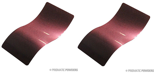 The one on the left is called “Cherry Crunch”, the one on the right is called “Super Cherry”. As you can see, the colours looked identical on-screen. And as you recall, screen colour and crayon names are about as useful as … well, not useful at all. But in the absence of a suitable alternative, I did the colour picking equivalent of a Hail Mary and picked Cherry Crunch.
First the frame was sandblasted naked.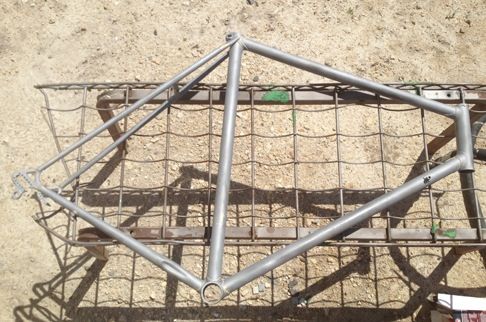 The frame was naked, not Paul. One should never sandblast without clothes on.
Next, the dents were filled with a weld epoxy that is good to 600 degrees and will therefore withstand the heat of the 400 degree oven. 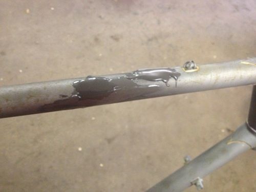 The frame was then primed with a black undercoat.
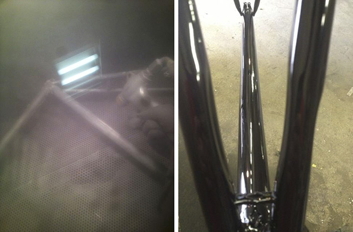 And finally, the powdercoat was applied and cooked.
As soon as the frame came out of the oven, Paul sent me this photo with the following message:
“It’s not as purple in person.”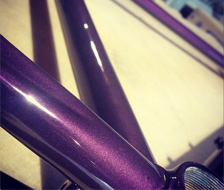 Holy. Shit.
Colour is a very subjective thing, and our perceptions are formed by a complex combination of experiences and exposures, both conscious and subconscious. But I’m not sure on what planet the cherry crayon is fucking purple.
While there is nothing wrong with the colour purple per se, I am not really a fan. Perhaps it’s because when I think of purple, I think of this: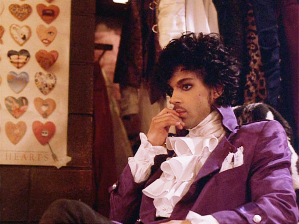 Or this:
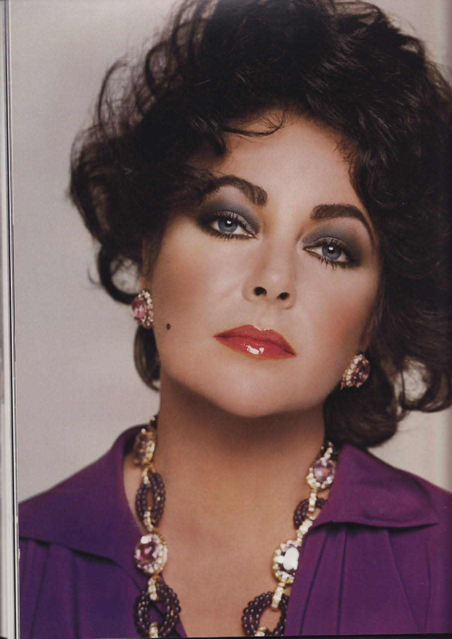 Or this:
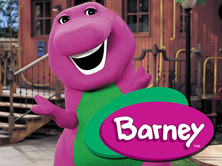 I also think of the grandkids of our elderly neighbours that we were forced to play with, who were annoying and always seemed to be sporting grape Kool-Aid moustaches. Awful.
Needless to say, the colour of the bike was disappointing – so much so that I almost aborted the project altogether. But after a couple of days of pouting the colour started to grow on me. A lot. I found myself dragging the frame out of the back of the car to look at it, amazed by how the colour changed in different light.
And then there was the workmanship. Paul (who was as surprised as I was by the colour) did an amazing job at patching the dents in the top tube, and even powder coated the water bottle bolts. The finish is nothing short of spectacular. And oddly, in the warm light of the morning sun, it is exactly the colour I wanted.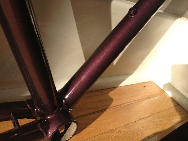 I have also surveyed a number of people about the colour – both men and women – the the reaction has been unanimously positive. And so the project continues.
One lesson I did learn was the importance of seeing an actual physical sample of the colour before committing, something I should have taken the time to do given the relative ease of doing so through the manufacturer’s website, not to mention my fussy sensitivities when it comes to colour.
Compared to the complicated colour conundrum, building the rest of the bike should be a snap. After all, parts will either fit or they won’t, and there is no subjectivity required to install a bottom bracket. Or so I hope.

ARE YOU KIDDING ME? THAT PURPLE IS SWEET!! If you don’t like it, I will gladly take that frame off your hands.
Sorry Mark, you just made me love it even more.
Hey no one else will have one like it. Which I thought was kind of the point. How long will it take you to find bar tape to go with it? 🙂
Haha! Don’t even get me started.
Rule #8 // Saddles, bars, and tires shall be carefully matched.3
Valid options are:
Match the saddle to the bars and the tires to black; or
Match the bars to the color of the frame at the top of the head tube and the saddle to the color of the frame at the top of the seat tube and the tires to the color where they come closest to the frame; or
Match the saddle and the bars to the frame decals; or
Black, black, black (-;
Does it follow that this bike will be named “Barney” ? “I love you you love me” all the way down the crescent.
*shudder*
Next up, travelling to Milan to find original decals?
Oh, I like the way you think, Dave.
Purple is an awesome color, and bottom bracket fit is totally subjective. Just think about all the ways you can go about correcting your chain line.
Oh hey, that colour is just like my mini-van! I love my mini-van!
Re: color table. It’s the designer in you—you showed remarkable restraint leaving it as it was, my fingers are itching to organize it! Love the color—you could always put I Would Die 4 U along the top tube…
Sweet colour! Now you’ll just have to borrow Donny Osmand’s purple socks while riding it.
[…] where I am at with the Guerciotti project, the one on bottom brackets can’t come soon enough. The “unsticking stuck parts” […]
That is such a unique colour! I absolutely LOVE it! Just out of curiosity, what kind of finishing did you get? it looks great!
Hi Sara
It’s a powder coat, the colour is called “Cherry Crunch” – a metallic powder from Prismatic Powders. I think any powder coater should be able to get it, depending where you are. Glad you like it!
Ok thanks so much! Looking forward to using it on my next project.
[…] the fabulous purple powder coating done, the next step was to “face and chase” the frame, a process that cleans the […]