Specialized-lululemon: What all the Fast Girls will be wearing next year
Late in the summer, top-ranked women’s team HTC-Highroad found themselves without a dance partner. Not having a sponsor is not a good thing, because no sponsor means no team, and no team… well, sucks. Thanks to some determination and quick deal-making, the team secured Specialized and Canadian athletic clothing maker lululemon as head sponsors and the team was saved. Thankfully, the majority of the riders – including girl-rocket Evie Stevens – elected to stay together under the new team banner. Even more exciting was the fact that they signed my girlfriend and fellow Winnipegger Clara Hughes. Of course when I heard the news, the first thought that ran though my head was “I wonder what the KITS will look like!!” For those of you who have been imprisoned in a Russian Gulag for the last 10 years, lululemon provides high-end yoga and athletic wear to a worldwide cult of toned, upper-middle class fitness enthusiasts. You only have to go as far as the hippie aisle of your local Safeway to see the lulu army out in full force. Their clothes are well-made and stylish. More importantly they actually fit women’s bodies – which tend to be bendy, lumpy and quite hard to wrap.
 Needless to say, I was dying to see what this company would do with cycling gear. Here is what they came up with (photos by Heidi Swift):
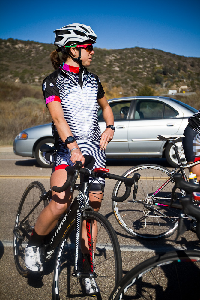
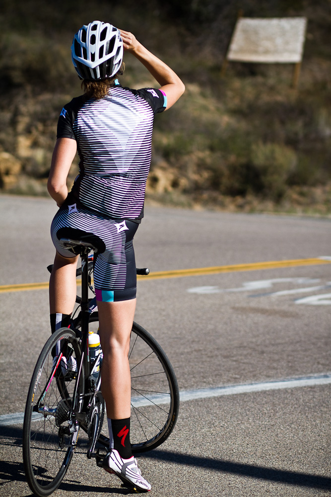 First impression – very nice. Different, good colours. I like the lulu-inspired graphic even though it hurts my eyes a little and makes me think something is wrong with my monitor. The colour blocks remind me of the Rapha team cyclocross jersey, but everybody knows designers are slutty and steal each other’s ideas all the time. And they are good colours. At least the whole damn thing isn’t pink.
Second impression – WHERE ARE THE ENORMOUS LOGOS??? Perhaps it was an oversight, but it is extremely unusual to see a kit without the major sponsor logos splattered as big as possible across the chest and back and any other visible piece of real estate on the body. In fact, I’m surprised sponsors don’t insist the riders bulk up in order to facilitate a larger branding area. Of course I am more confused than displeased by the understated logos – but to be more in keeping with the norm, shouldn’t it look more like this?:
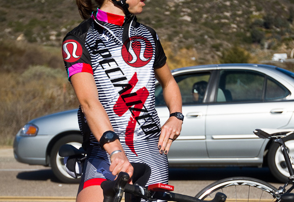 I mean just look at the old HTC kit! It’s positively exploding with logos.
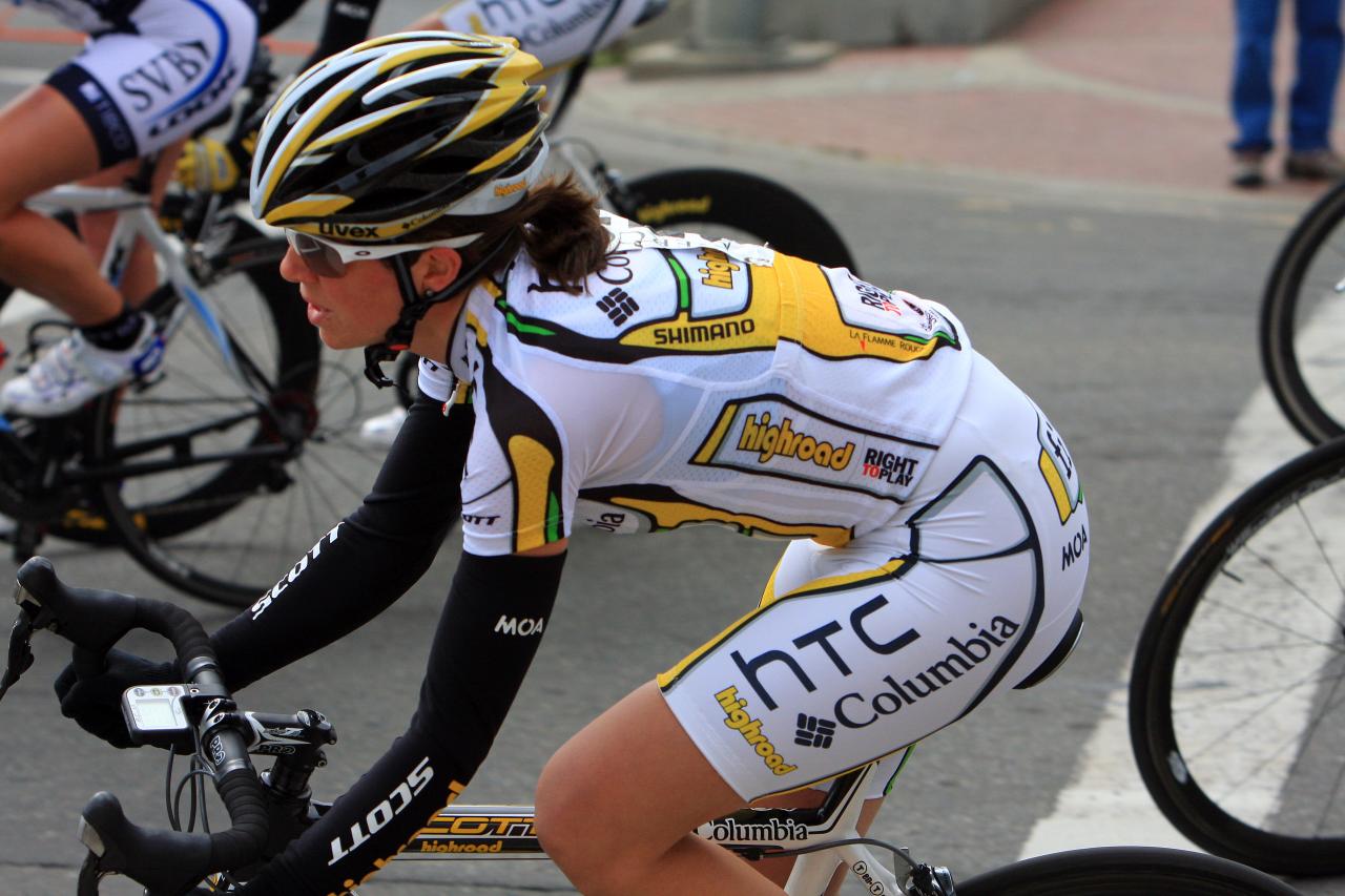 Weird. Well, maybe they’re still working on it. Or maybe the sponsors haven’t seen it yet. (If not, man, are they gonna hit the roof.)
What I am perhaps most curious about is the fit. I am assuming the kits were actually made by lululemon and therefore comfortable enough to handle the most pretzel-like of body positions without bunching, gaping or pinching – and flattering enough to wear to my local Safeway.
Does this mean a new line of lululemon cycling wear for women? I shall remain cautiously optimistic.

I actually love it. Nothing like blinding your opponent on the sprint. Might confuse them into cutting the wrong direction.
Yes, it certainly does vibrate!! It’s the lululemon version of “Shock and Awe”.
If you look at it long enough, you can see 3d shapes of their logos.
Ooooh! I didn’t realize you needed the special glasses…. now I get it!!!
Andrea,
I like your jersey a lot more than their actual jersey. If I were you I’d send your version off to the team as a suggestion. Who knows, maybe they’ll adopt some or all of it and give you a free one as a thanks? Maybe invite you to train with them in Arizona?
Thanks Terry. I think you’re on to something…
What’s up? No comment on the black sox with white shoes? I am disappointed.
My Bad! Shame on me for missing such an obvious fashion infraction. Must be the post holiday detox messing with my senses…
Just found your blog. Cool.
Lot of pro kits say something on the outside with a someone elses pad sewn in, plus the cut is custom to the rider.
Where can we buy these outfits?