Jersey Boys, Part Deux
Mon Dieu!!
It is practically Tour de France Eve and I have left you all hanging on the edge of your saddles, waiting for the second half of my review of the 2011 team jerseys. Shame on me!!
I have demonstrated on many occasions that I have a rare talent for being an outspoken critic, particularly on things I know little to nothing about. And there’s nothing I love to criticize more than design and fashion, which I actually do know something about. As I began to look at the remaining team “outfits” it occurred to me that I left the boring ones for last. So, to keep you reading, I’ll start with the most spectacularly boring one, namely Quick Step. 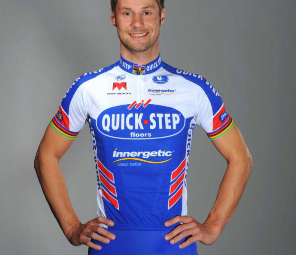 I find this jersey so uninspiring I practically fall asleep just looking at it. It doesn’t surprise me that Quick Step is a flooring company, because this jersey looks like a crappy ad for a flooring company. Not even the world champion armbands pull this one out of the toilet. However, the shorts caught my attention, but only because Mr. Boonen’s legs are so spectacular.
 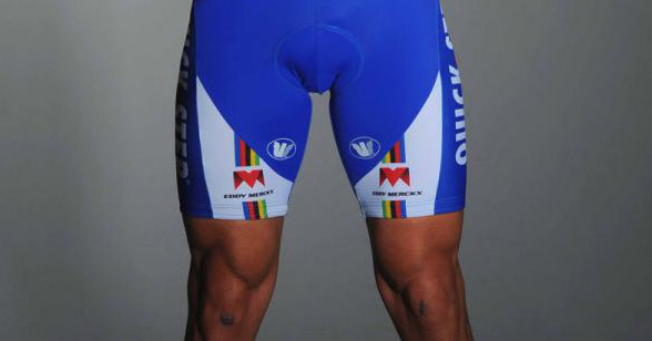 God, what I wouldn’t give for legs like that. I would touch them ALL THE TIME – and never wear pants.
It’s amazing what good product photography can do. At first glance, I did not care for the BMC kit at all. 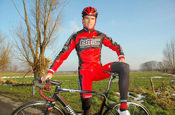 The silly ballerina pose does not help. Guys dressed head-to-toe in lycra should be more careful. The colours seem flat, and I’m not really getting the weird blockiness going on. But bring that puppy into a studio with some good product lighting, and all of a sudden it’s actually pretty sexy.
 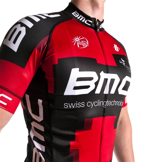 Maybe not Liz Hatch sexy, but close.
 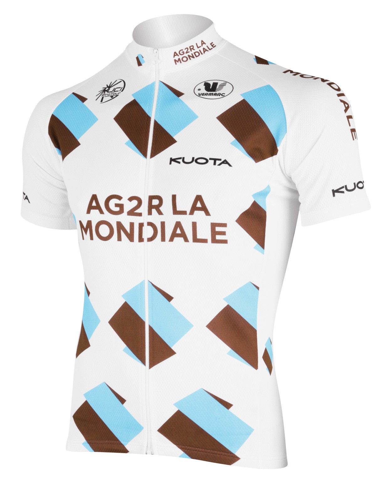 It’s not so much that I dislike the AG2R jersey – in fact I would even forgive what I thought was a subtle and covert rip off of Garmin Cervelo’s argyle (which they inexplicably dropped in favour of looking like everybody else). But then I discovered the graphic pattern is merely a “step and repeat” of the sponsor’s logo, which as far as insurance company logos isn’t half bad, but could have been handled with a bit more finesse. Maybe the designer was wearing oven mitts that day.
 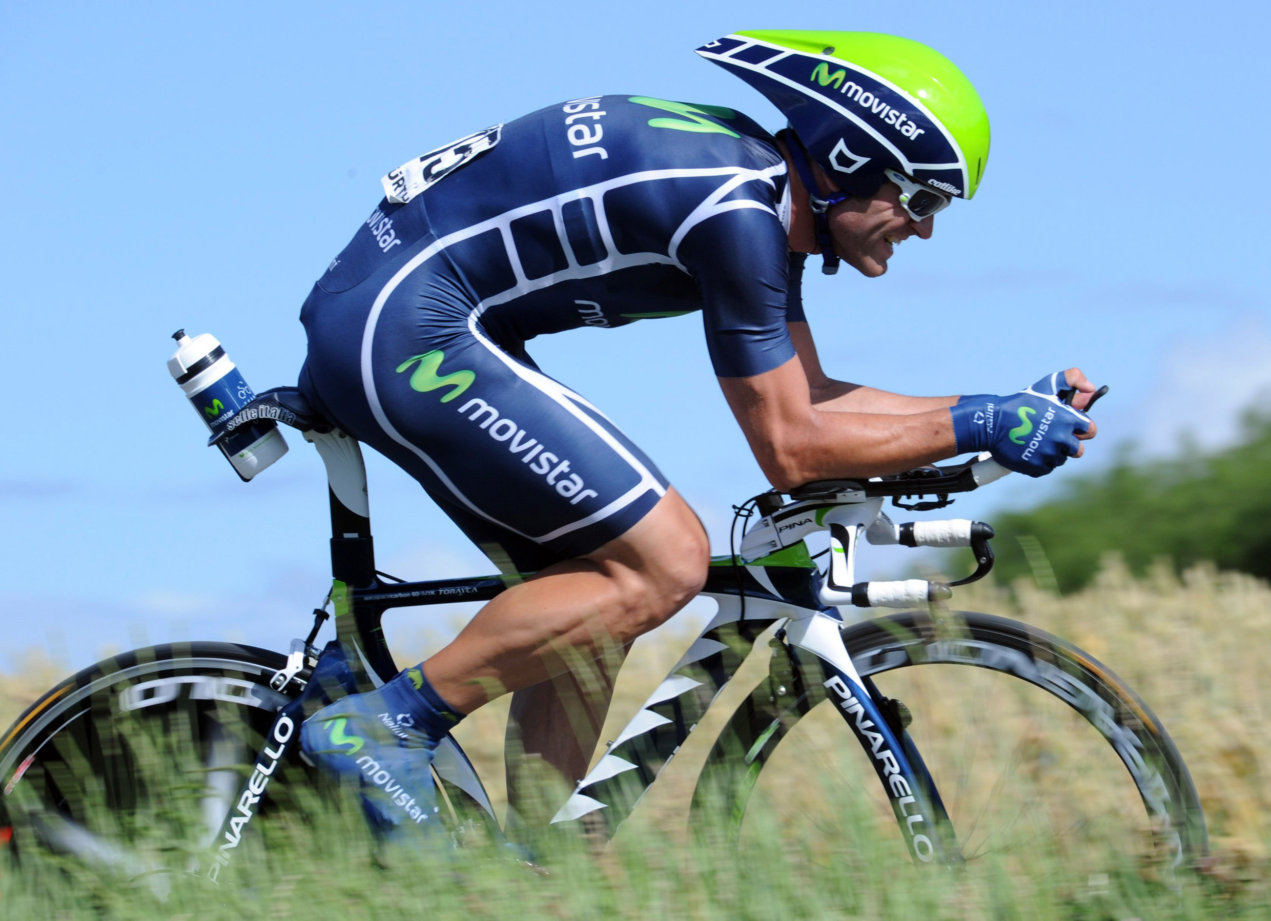 The Movistar kit looks wicked cool from the side, with an interesting “ladder” running up the rider’s leg and torso. But the blobby green “m” – again the product of an unfortunate sponsor logo – reminds me of Flubber. The hubby thinks it looks like a diagram of fallopian tubes.
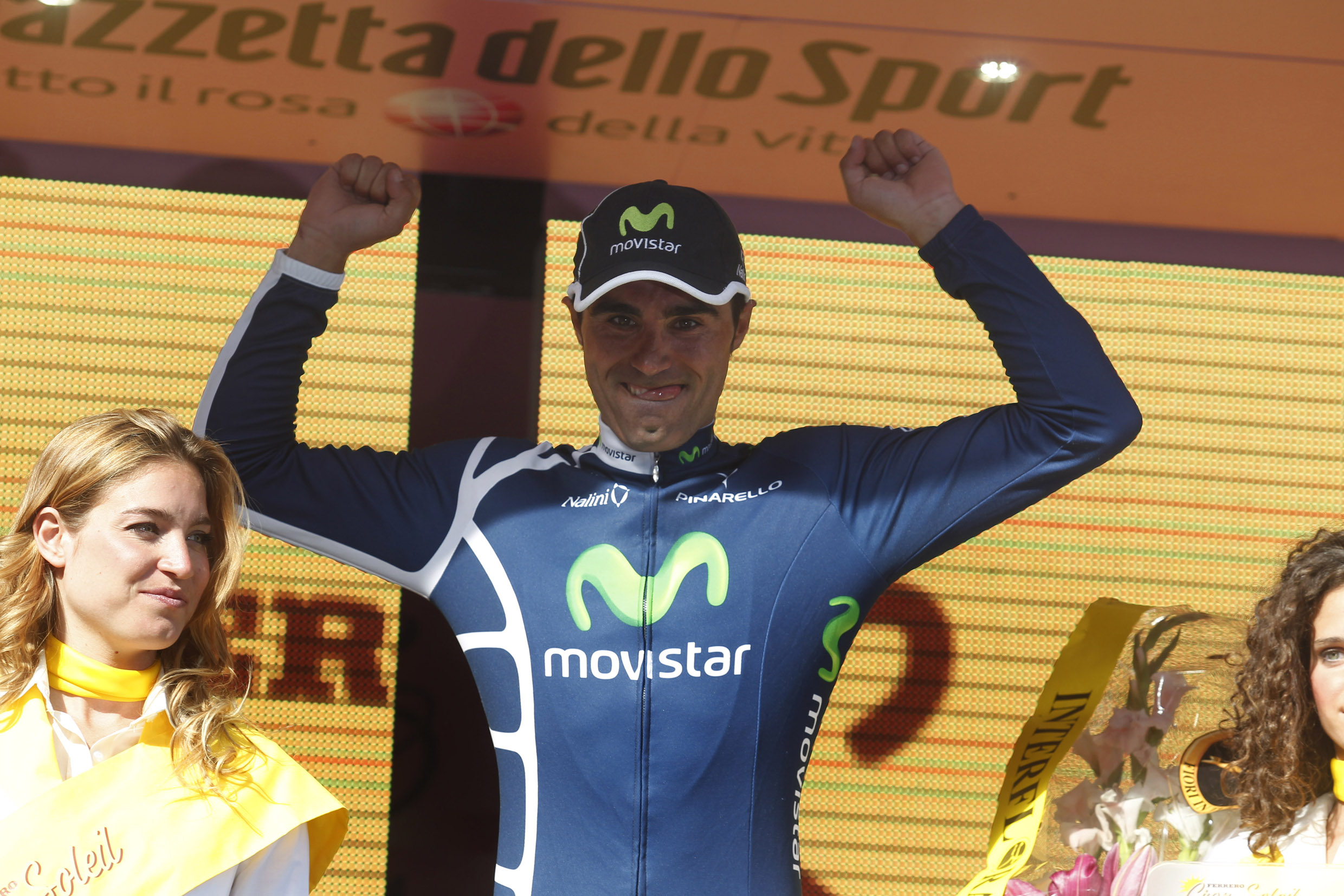
 If I was going to say anything bad about the HTC Highroad jersey – which I’m not – I’d say the logo placement is unfortunate. It interrupts the vertical stripes like a burp during a kiss.
 But I would never say that, because after my very public breakup with Lance I have decided that Mark Cavendish is my new boyfriend. In fact, our birthdays are only one day (and 16 years) apart.
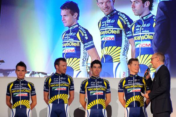
The Rabobank jersey was really nice last year, but this year they decided to jump onto the (horizontal) band (across the chest) wagon like everybody else. Pity. 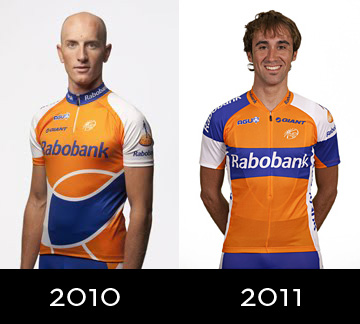 Vacansoleil‘s kit suffers from toomanylogositis. I understand the need for sponsors and sponsor visibility, but these skinny little guys don’t offer much in terms of billboard space. Perhaps the sponsors were under the mistaken impression Vacansoliel was a a Nascar team.
I’m kind of warming up to Katusha, and like the texture they’ve added which creates a nice transition from the bottom of the jersey to the top of the shorts. But someone really should have proofread “Katusha”, which is spelled horribly wrong.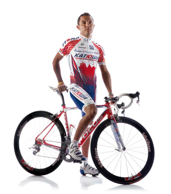
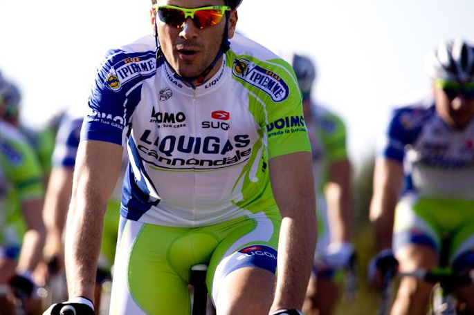
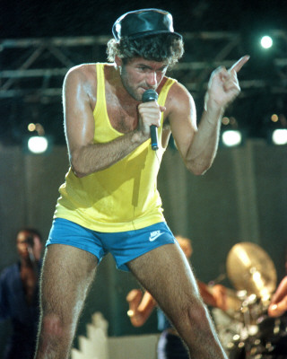
And last but not least is Liquigas, who decided to be a little more sparing this year with their use of neon green. Maybe it was because they just wanted a change, or maybe they were sick of being asked if they were Wham!.
There you have it, an in depth analysis of the entire pro peleton, Cycle Chick style.
Vive le Tour!!!

Love the post! Your comments are hilarious!
oh, oh; Garmin-Cervelo and Team Sky have new jerseys for the Tour. Better get out your sharpened penwit…. We will be expecting an updated viewpoint!!
I agree with Rick. Obviously, Sky and Garmin have taken your critique to heart and changed some things before the big race. What do you think?
Love this lovely. But they have not listened