Jersey Boys, Part 1
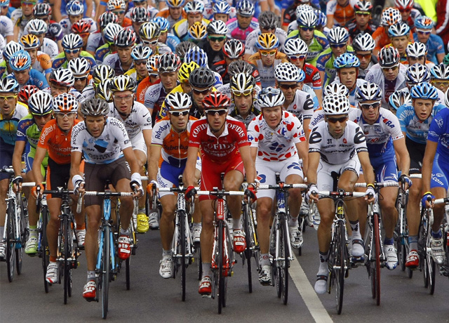 This is a very exciting time of the year because in January, all 18 pro cycling teams release their rosters, equipment lists and, most importantly, their kits. A “kit” is just a fancy word for a cycling “outfit”, but I guess “outfit” isn’t quite macho or cool enough for the pros who, for the most part, have the physiques of emaciated 12 year-old girls.
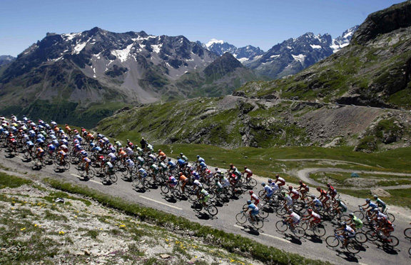
Riders will wear their kits for the entire year, rain or shine (I’m assuming they get more than one) to help distinguish their team from the others. This is a pretty important thing, because during big races, with 200-odd guys whizzing by at 45 km/h, you need to be able to tell who’s who, especially when you’re watching footage filmed from a helicopter and the riders look like a pile of Skittles rolling down the road.
While the pros will have disagreements with their coaches, teammates, and even their bikes, their kits are constant and unfailing companions on the road to victory or failure. They are also one of the only ways I can keep everybody straight when I watch the Tour de France in July.
Last year I made some predictions based on the jersey line ups of eight teams, which was the limit of what my minuscule attention span could handle. Because of their hideous salmon-coloured jerseys, I predicted Team Footon Servetto would suck, and they did, placing 20th out of 22 teams. Team RadioShack scored high marks with me for their sweet jersey design (not to mention my boyfriend Lance) and came in first. So it just goes to show, if you look good, you feel good. If you feel good, you go faster.
One of the first things I noticed in this year’s collection of jerseys is the startling similarity of Team Sky and Garmin-Cervélo.
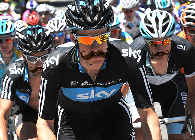
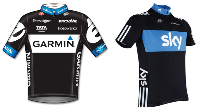 While not quite as embarrassing as the great Leopard-Trek fashion faux pas, I do fear that the similarity of these outfits will make these two teams virtually indistinguishable, even at close range. My suggestion would be for one team or the other to grow enormous handlebar moustaches, which would help differentiate them while still being true to the spirit and history of bike racing.
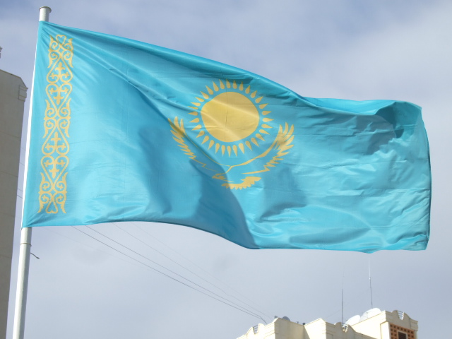
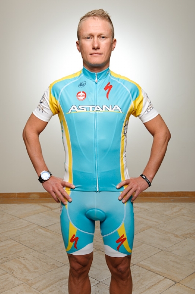
 I am torn about Astana. Their kit is basically the flag of Kazakhstan without the sun on it. Come on. Show some creativity people. I do, however, love the colours and the simplicity.
But beyond that, my dilemma has more to do with the fact that I really like Vinokourov (who in spite of his previous drug issues never fails to please me with his fortitude, enormous ego and general Eurotrashiness) but hate Contador with the burning intensity of a thousand Kazakh suns. Here is a picture of Vino. The little Spaniard’s photo is nowhere to be seen on the team website, likely due to his as yet unresolved “meat” issues.
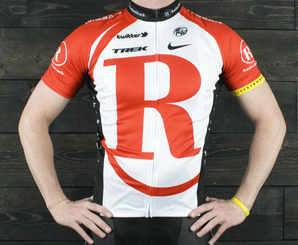
Team RadioShack managed to come up with another winner this year. Perhaps they should consider using some of that awesome design power to make their crappy electronics better. I’ll wager the team radios don’t come from RadioShack. Oh and fellas, I’ll give you the yellow armband, but the yellow bracelet is like so done.
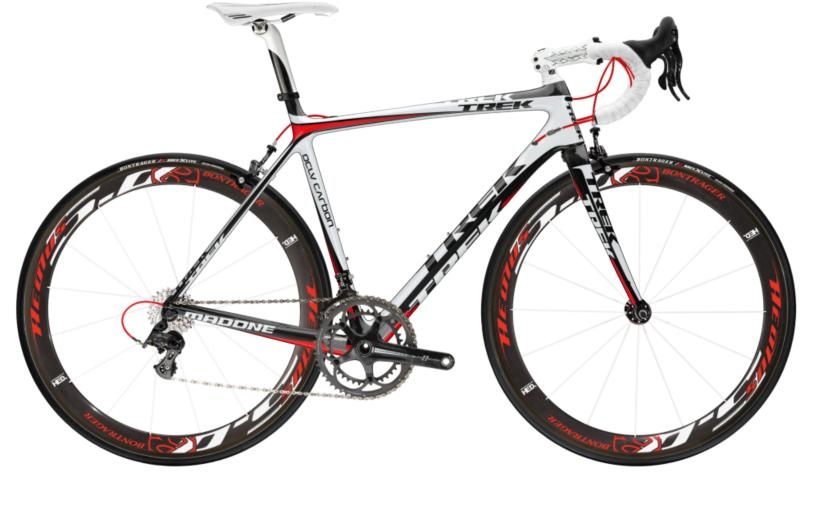
I also think this kit would look smashing with a brand new Trek Madone 6.9. Yes, indeed. This team will do well again.
 While they will certainly not get any points for the hottest looking riders, the award for the most obnoxious yet highly visible kits goes to Lampre-ISD and Euskaltel-Euskadi. Whatever these kits lack in design ingenuity (which is plenty) they make up in pure unbridled exuberance. Not only will you be able to clearly see these guys from the helicopter, I suspect you may be able to see them from space.
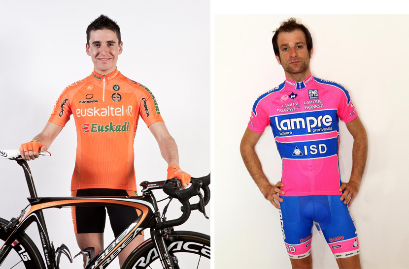 I think the photo of the Lampre rider might actually be a mug shot.
I’m not sure what kind of drugs they give the Team Saxo Bank-SunGard guys, but they should certainly share some with Lampre and Euskaltel.
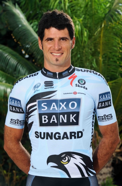 Oh and the jersey’s ok too. Except for the eagle at the bottom, which is kind of cheesy, but somehow works with the copious amounts of arm hair. The colour is quite similar to the new Leopard-Trek ensembles, which is ever so slightly more “celeste”.
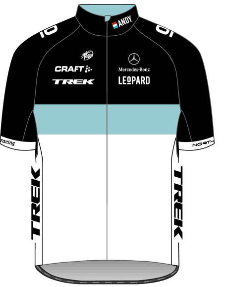 This is actually a photo of Andy Schleck, who is now so skinny he is two-dimensional.
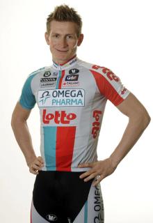
I love the retro and classic feel of the Leopard-Trek jersey. I love the colours, and the balanced and understated way they handled the always hideous “logo garden” these things invariably have to include for their sponsors. Unlike the Omega Pharma-Lotto jersey, which looks like it was vomited on by a Walmart.
 Well there you have 9 of the 18 teams, and my attention has officially run out for today. And if I’m sick of writing, I’m guessing you’re sick of reading. I will have to attend to the other 9 in a subsequent post.
Stay tuned!
I cannot wait for part two. LOVE some of these. The entire thing makes me want to go shopping…ok everything makes me want to go shopping…especially to the bike store : )
Between the local content, well written rants, and pro tour info, this blog gives me no reason to renew my subscription to Bicycling magazine. Well done – you just saved me $25 a year! I wonder what kind of accessory I can buy with my newly saved $25? Do they make carbon fiber valve caps?
Wow, assuming you’re not being sarcastic, that’s the nicest comment I’ve ever had. Thank you. As for the $25, spend it on beer, you don’t need valve caps, carbon fiber or otherwise. Better yet, you can buy ME a beer. Cheers!
[…] reading my review of their team jerseys, Garmin Cervélo and Team Sky have gone back to the drawing board (or hired new designers) and […]