
The Tour de Pants
With the Tour de France a mere 3 weeks away, I have been trying to get more familiar with the teams, the riders, who are the favorites to win and so on. This is proving a difficult and confusing task. Perhaps I am merely missing that unique genetic thing that allows men to remember football or hockey statistics from 20 years ago while they can’t remember their own phone number.
It’s also difficult without the usual “human interest” aspects, such as last year’s trash talk between Astana teammates Lance Armstrong and Alberto Contador (my favorite being an Armstrong tweet to Contador in which he calls him “Pistalero” and reminds him there is no “I” in “team”). Good one Lance. I bet that really hurt his feelings.

There are of course the usual doping scandals, and now the hubub about Swiss cycling star Fabian Cancellara allegedly using a “motorized” bike to win this year’s Tour of Flanders and Paris Roubaix, but beyond that, it can be pretty uninspiring.
So I’ve decided to assess the teams according to my own “CycleChic” methodology: their outfits.
I have to say it is disappointing to see how poorly the Europeans do in this area, considering they are the world leaders in “civilian” fashion. Europe is the birthplace of couture, and also sports the largest spandex-wearing population in the world. When it comes to team cycling kits (a fancy term for outfits) they are often guilty of odd and sissified colours and indiscriminate “logo plopping”.
By far the ugliest race kit belongs to Team Footon Sevetto from Spain. As if the slack “hang ten” footprint weren’t enough, the team colour is the most putrid shade of “skin” imaginable. And from a distance gives the distinct impression the rider is naked.

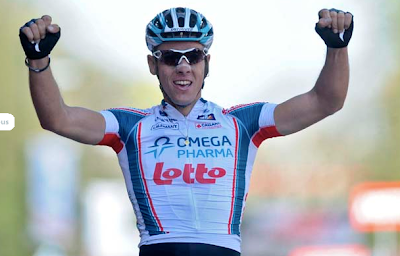
Many of the team jerseys are just plain boring and uninspired. Like these two:

Boring, boring, boring. Even the pose is the same. The only interesting part of the Omega Pharma Lotto jersey is the funny red bits under the arms. Presumably designed to hide unsightly yellow stains. Pure design genius.
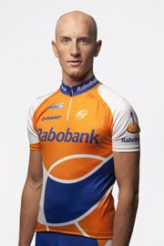
Unlike it’s European neighbors, Rabobank (The Netherlands) has got it going on. While this rider would be exponentially more attractive with hair, the jersey is quite lovely. It is graphic and clean, with excellent colours and considered composition. Having said that, the swoops across the tummy are a bit unflattering, even for an emaciated pro cyclist like this guy. If it makes him look like he has a paunch, imagine what it would do to your average age grouper. Not pretty, I assure you.
Lance’s new Radio Shack Team sports a fantastic looking kit. This is not surprising considering the money machine that follows him everywhere he goes, and subsequently the great design it affords.
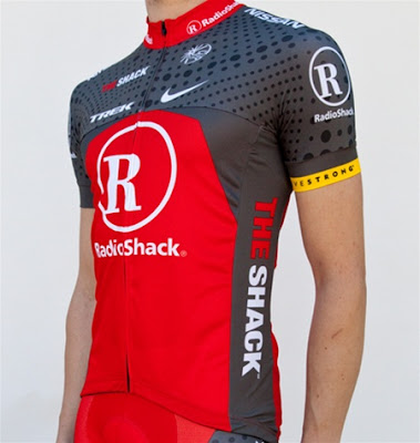
But no matter how cool this jersey is, it still sports the logo of a store that sells crappy electronics. And the new nickname (The Shack, seriously?) and magazine ads featuring Mr. A. are nothing short of embarrassing.

Finally, to Belgium’s Quickstep team, or at least this rider, who gets top marks for really working it for the camera.
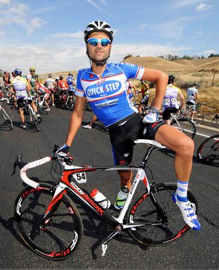
Whatever they lack in design finesse the Belgies make up for in unabashedly enthusiastic posing. The position is confident and suggestive. Suggesting what, I’m not sure. Maybe he really likes his bike. I mean reeeeally likes it. And I am cool with that.
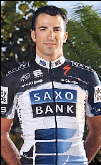
So there you have it, eight out of twenty-two teams figured out completely. According to my research, Team Footon will do poorly due to an obvious lack of cute uniforms. Rabobank might have a shot at it as long as they suck in their tummies. Watch out for Saxobank because they are hot, hot, hot. Radio Shack looks good but may have some serious problems with their radios, and Quickstep will certainly put on a good show.
Who said learning about a pro sport has to be hard? Turns out there’s nothing to it, even if you’re a Chick.
I agree with this post entirely – except the hair comment.
I was laughing so hard I spat my coffee all over my computer. I LOVE the pink with genle glide…I would SOOOOO wear that.
I was laughing so hard I spat my coffee all over my computer. I LOVE the pink with genle glide…I would SOOOOO wear that.
If there were cycling hashers, the Foot on jersey's would win!
Nice!
That post was just right up your alley. I have to go back on the feminine "gentle glide" proposal you make. I can't help but to compare the practice that some of us make of shaving our legs. That feminine side, sorry guys, we all have and I would applaud a sponsor for getting it. Actually, CycleChick what do you make of shaved legs?
I am all for it, as far as the aesthetics go. I think it makes a nice pair of muscular legs look even better. I don't buy the excuse guys make that it makes them more "aero". Total bullshit. The other upside is if you crash you have less risk of infection, and avoid the humiliation of being shaved by the nurse.
[…] of limitless useless sports statistics. Last year I tried to remember the teams based on their jerseys, but thanks to all the sponsor-swapping, this year I will have to start all over again. I hope they […]
[…] year I made some predictions based on the jersey line ups of eight teams, which was the limit of what my minuscule attention […]
[…] selected my team of riders for the pool using much the same logic as my picks for the TdF. I picked names I recognized, and the rest I picked because they sounded good. How could someone […]