20×20
Back in May, I was asked to give a presentation at Pecha Kucha, an event where a number of speakers have 20 seconds to talk about 20 images on a topic of their choice. The audience is generally made up of graphics designers, architects and anyone else who looks good in a black turtleneck.
In spite of my crippling shyness around people, I agreed to present – on the condition I could talk about cycling. The challenge was to find a cycling topic that would be accessible to an audience who primarily doesn’t give a hot shit about it. I tried to imagine sitting through a like presentation on golf, and the pain I would feel as I killed myself slowly with a plastic fork from the canteen.
Following is the presentation I gave – twenty images and the twenty seconds of attempted brilliance and hilarity I used to describe them.
01.
 We all have an alter ego, right? I recently discovered that mine happens to be a blogger and cycling fanatic called Winnipeg Cycle Chick. Tonight, she wanted to talk about geeky bike stuff. I wanted to talk about branding or maybe shoes. Thankfully we discovered that cycling has some very interesting ties to design, marketing, and yes, even fashion.
02.
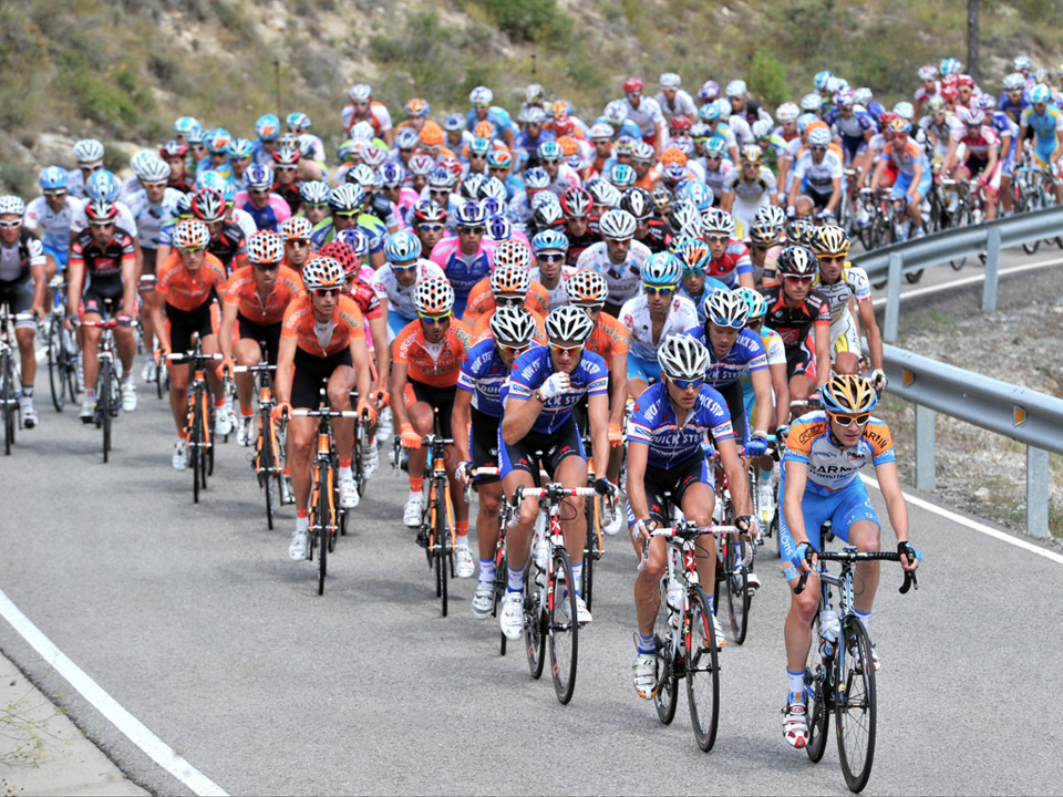 Shockingly, one of the first things that attracted me to road cycling was the clothes. I loved watching the Tour de France on TV, the peloton gliding down the road like a colourful herd of stampeding emaciated jellybeans. But when it came down to understanding the sport, and what the different jerseys meant, I was absolutely clueless.
03.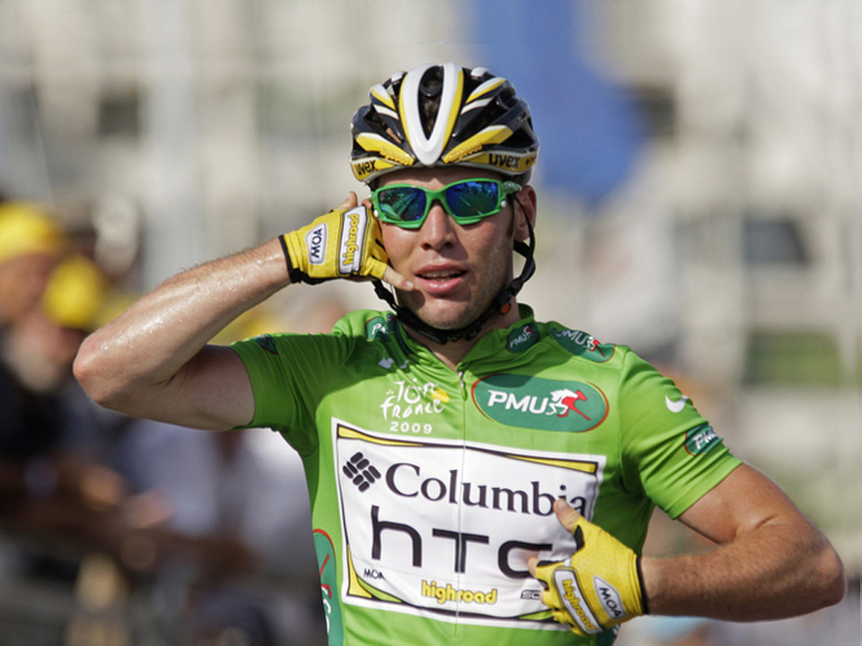
Like most professional sports, cycling is all about sponsorships. If you’ve ever watched the end of a bike race, you’ll notice that just before the finish line, the racers will quickly sit up and close the zipper on the front of their jersey, even if it’s 40 degrees kelvin outside. It’s because that’s where the main sponsor logo is, and THAT is the money shot.
04.
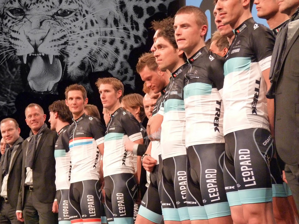 There are teams, generally named after their main sponsors, which change from year to year. So it’s luck of the draw whether or not you get a cool sponsor. Trek, an American bike manufacturer, called their team “Leopard Trek” to make it sound cool, then wrecked it when their over-zealous branding department dictated the name be pronounced LAY-O-Pard Trek. Good thing they have cute outfits.
05.
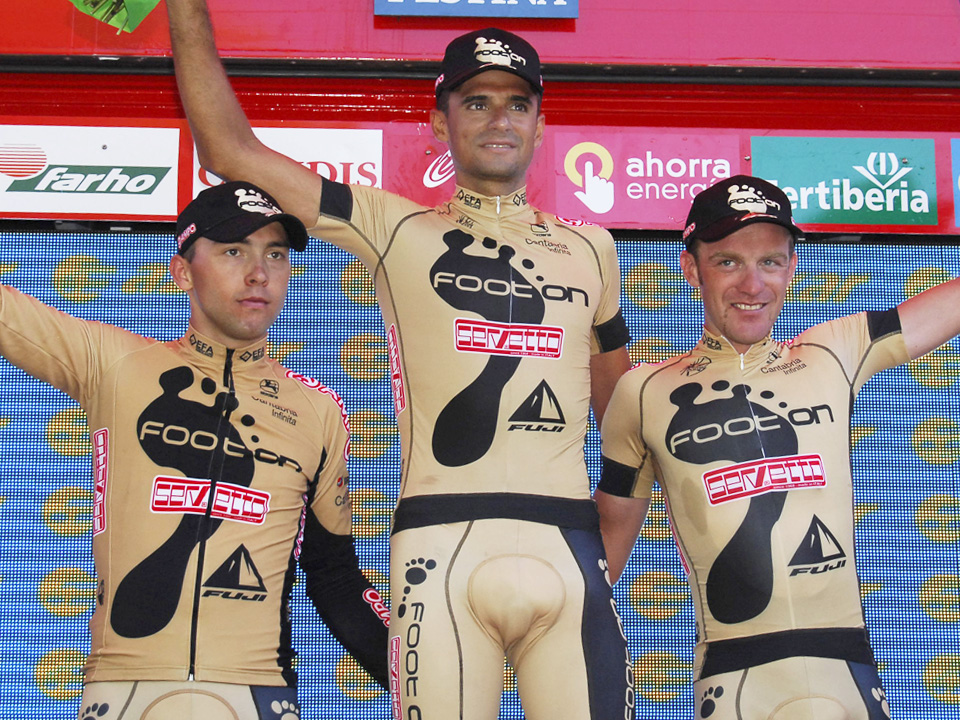 Unlike Team Footon Servetto. Footon is a Swiss company that makes decidedly un-cool products like shoe insoles and bunion pads. Hence the slack “hang ten” foot adorning the riders bellies. If that wasn’t bad enough, they picked the most putrid and unbecoming colour for their kits, which, at a distance makes the riders look like they’re naked.
06.
 Cycling is a very male dominated sport, so I wonder what they would do if a company like, oh… say Playtex came to the table with a team. We already have bunion pads covered… why not maxi pads? I can just imagine Team Playtex “gently gliding” their white bikes in slow motion down the beach in white cycling shorts.
07.
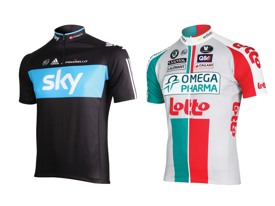 As anyone in design or advertising knows, where there are sponsors, there are logos. And when you have lots of logos, you are forced to tend the dreaded logo garden. Some teams, like Team Sky on the left, seem to have it figured out, with a balanced and harmonious garden – while other teams, like Omega Pharma Lotto on the right, look like they have been vomited on by a Walmart.
08.
 You don’t have to be a marketing genius to know how important differentiation is when promoting your brand. All three of these relatively uninspired jerseys were introduced by different teams this year, which makes me think they either got a 3 for 1 deal at the local photo copy place, or their design teams were all sleeping together. Or perhaps just sleeping. In either case there are likely some job openings.
09.
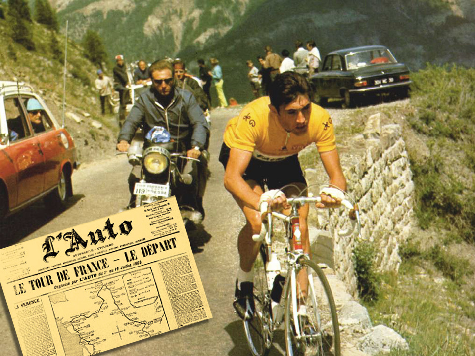 Speaking of differentiation, way back in 1919 it occurred to the organizers of the Tour de France that the race leader should wear something to distinguish them for the spectators. A bright yellow jersey was chosen because the race’s main sponsor, L’Auto magazine, was printed on yellow paper. The leader protested, preferring to remain invisible to his fellow racers .
10.
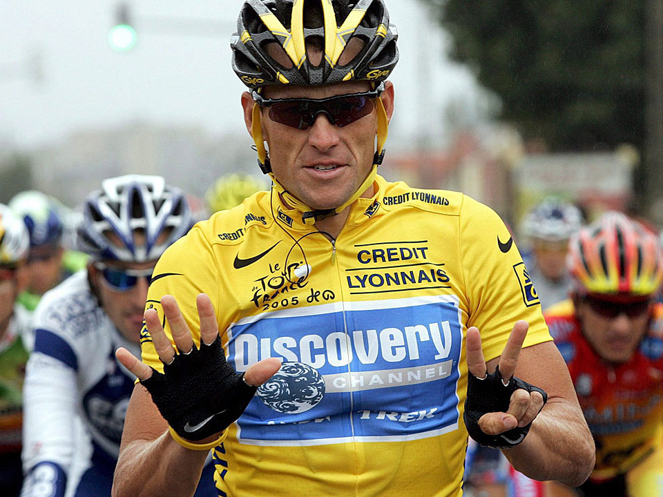 Today, the yellow jersey is one of the most coveted prizes in professional sports, and no one has won more of them than my ex-boyfriend Lance Armstrong, who is under heavy suspicion of illegal doping. I figure the only thing harder than winning a yellow jersey would be giving it back. Just imagine how hard it would be to give back seven. Keep your eye on eBay for seven slightly used yellow jerseys.
11.
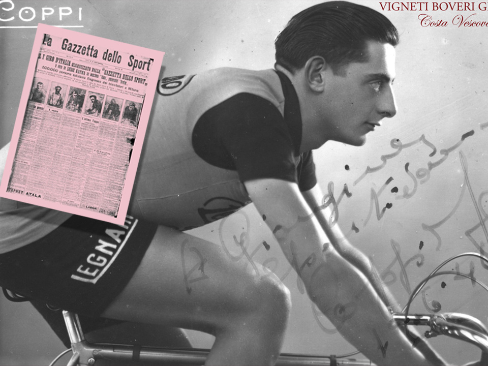 Not to be outdone by the French, in 1909 the Italian magazine Il Gazetto dell Sport introduced Italy’s answer to the Tour de France, The Giro d’Italia. Thankfully the Italians tend to be a macho bunch, completely comfortable with their masculinity, because Il Gazetto happens to be printed on the most Barbi-riffic shade of pale pink paper.
12.
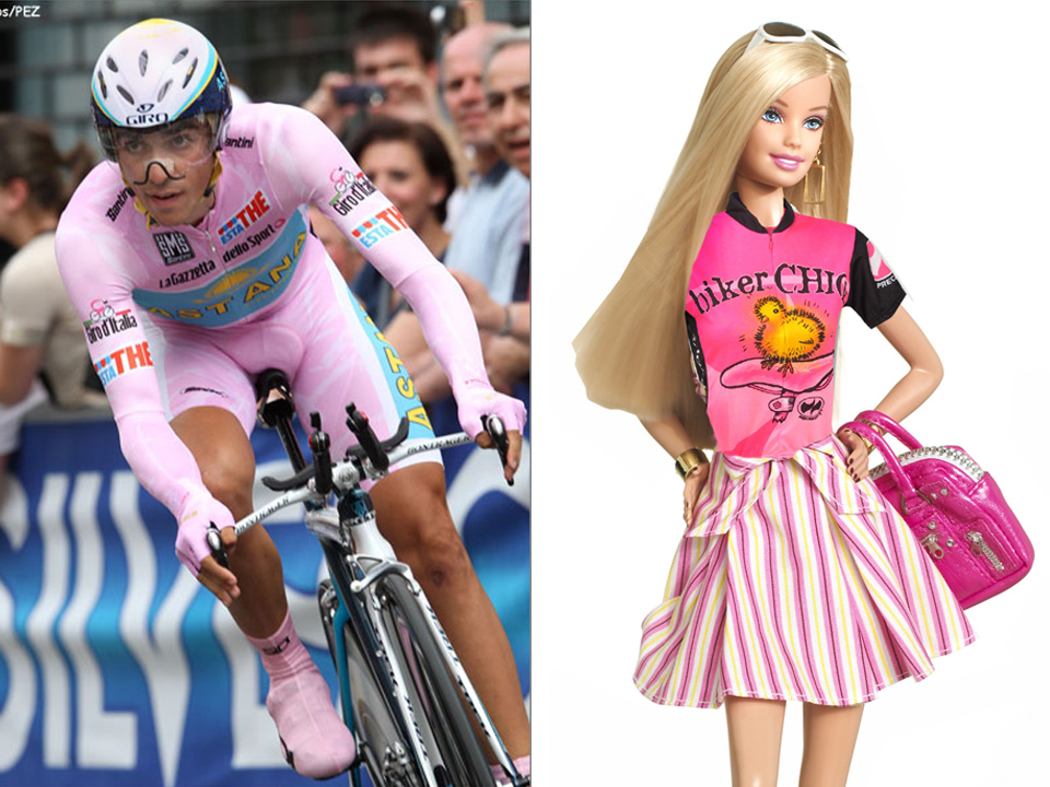 Believe it or not, the fellow on the left is modelling the second most coveted get-up in pro cycling, the Maglia Rosa or pink jersey. While we’re on the subject of pink, there is nothing on this earth that pisses me off more than the overwhelming sea of pink, flowers and butterflies adorning the majority of women’s cycling gear. If women are going to be taken seriously in this sport, please don’t make us dress like Barbie.
13.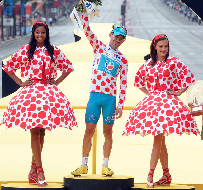
The “King of the Mountain” or “best climber” is forced to wear the ridiculously flamboyant polka-dot jersey. It was inspired by then sponsor Chocolate Poulain, who’s chocolates were packaged in a polka dot wrapper. I think if The Wiggles had a pro cycling team, this is what they would wear.
14.
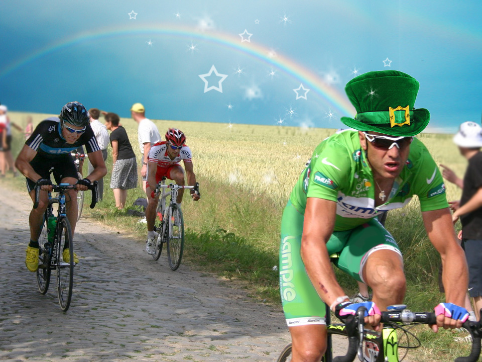 The Green Jersey is for the overall points leader, which means the guy who wins those crazy fast sprints at the finish line. Professional cyclist are generally very tiny people, like jockeys, or female gymnasts. You dress one head to toe in bright green and he kind of looks like a leprechaun. Maybe the green jersey guys are so fast because someone’s always after their lucky charms.
15.
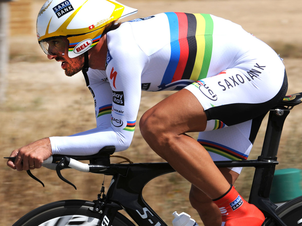 In a cycling context, the rainbow is identified with the world champion. So no matter what team jersey he wears, his mom has to sew a rainbow band onto it somewhere. In a social context, the rainbow is a symbol of gay pride. But I guarantee you that no self-respecting gay man would be caught dead in this outfit.
16.
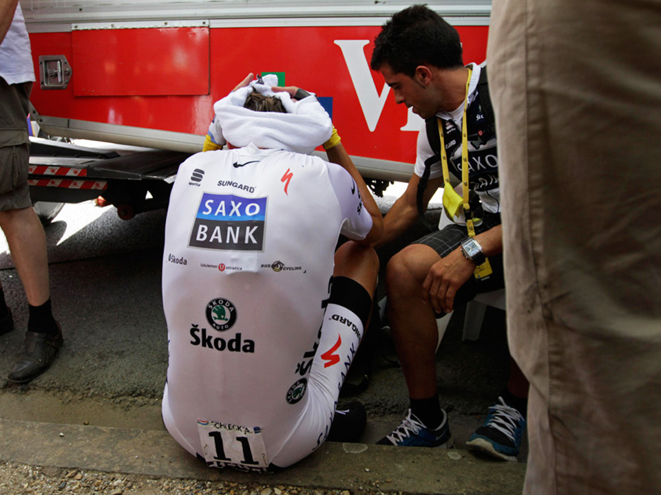 The white jersey is awarded to the best rider under 26 years old. I don’t care how young and skinny you are, nobody looks good in a white spandex jumpsuit. Believe me, I have ridden behind someone wearing white bike shorts in the rain, and let’s just say it wasn’t pretty.
17.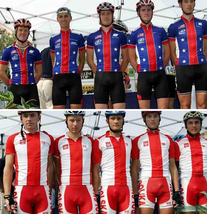
Speaking of bike shorts, I always figured bike shorts are generally black because black is slimming. Unfortunately whatever illusion the black provides is completely eliminated by the presence of the big foam pad they sew into the butt. And as you see here, there are far more practical reasons why bike shorts should always be black.
18.
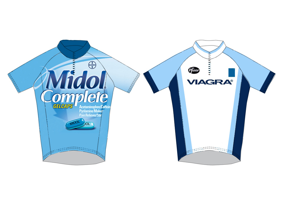 Doping, or the illegal taking of performance-enhancing drugs has become so rampant in cycling, I think there may be a marketing opportunity here for pharmaceutical companies. Bayer could sponsor the Midol jersey for the crankiest rider, and Pfizer could present the Viagra jersey to the oldest rider. Because nothing enhances performance like Viagra!
19.
 With all of the different jerseys there are, there are bound to be riders with multiple awards. Like this fellow who has won both the yellow AND the polka dot jersey. But surely to God there had to be a better solution than this. Did they even bother to talk to a designer? And they think it’s drugs that make the Tour de France a laughing stock.
20.
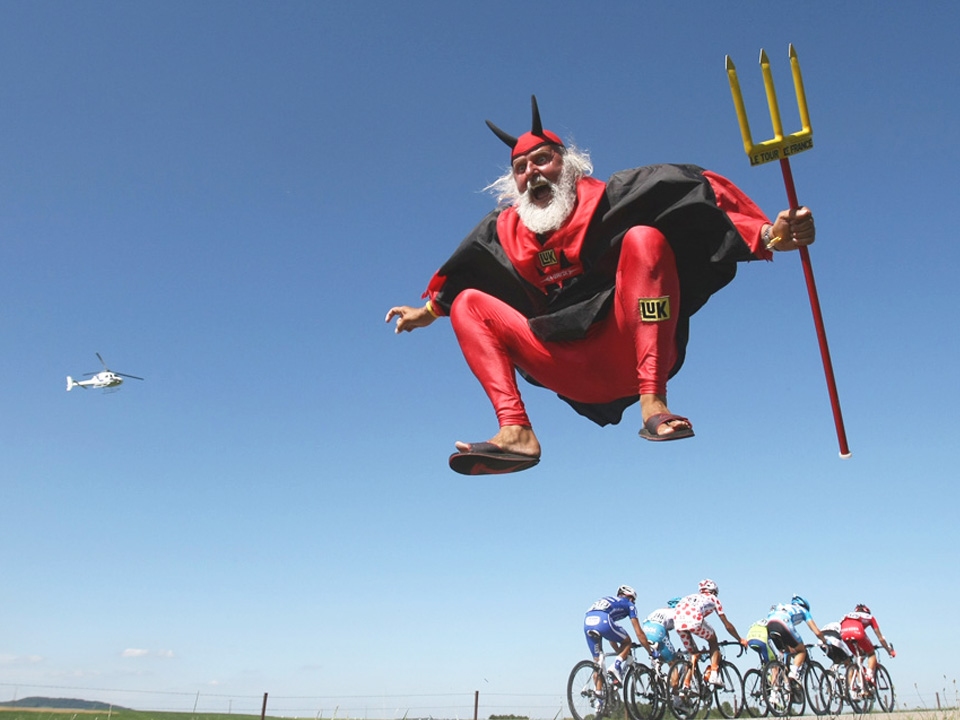 Professional cycling like many sports, cannot exist without sponsorships from major corporations, who in turn get enormous amounts of publicity. So although bike racing and branding may seem like odd bedfellows, there is no mistaking the ties that bind them. Both have a tendency of taking themselves a little to seriously and both are proof that how you dress says a lot about who you are.
What you wear really does say a lot about who you are. Long live Didi.
http://summerofbrad.wordpress.com/2011/07/21/el-diablo/
Ha! Just saw the link. awesome. Red is your colour.
Great article!
Just one little thing- sky is a british team, not an american team.
Still loved the article.
Thanks! Thankfully the audience I presented to didn’t seem to notice. I’m really hoping my grant application for a research assistant goes through. I recently posted something about Greg Lemond being a Canadian.
Thanks for posting this – it is as good today as it was in May!
I agree with my wife. Still makes me smile as it did in May thanks for the replay.
Thanks Andrea, so glad you discovered your alter ego. Your blog inspires me to head to my workout cave for another spin.
Beauty RJ! Do it. Might I recommend spinning to a zombie movie? I find the combination quite pleasant.
[…] FYI: We still need a permanent name and a logo to match would be nice too. If you haven’t read the CycleChick’s blog lately–do yourself a favour and check out her latest post (scroll to the bottom of this page for the link or if you’re lazy, just click here). […]