I Hate House
 Oh House Industries, how I hate you and your elegant and beautifully executed design solutions. I’ve hated you for a while now, with your always-perfect handprinted serigraph prints, clever housewares, and, of course, amazing catalogue of typographic genius. But after seeing the incredible work you did for master frame builder Richard Sachs and his cyclocross team, I hate you even more.


 I am a graphic designer. I love bikes. Do you have any idea how many people sent me messages, links, emails, Tweets and posts about this little project of yours?
Like, a million. It’s like being told over and over again how pretty your sister is.
I hate you for showing us a new way of looking at how design and cycling can come together in one brand that is contemporary and yet somehow speaks to a rich visual tradition, without feeling like yet another poor imitation. You’ve considered every detail, every angle, and somehow ensured the execution was flawless – a nearly impossible feat with something so complex and…well, fiddly.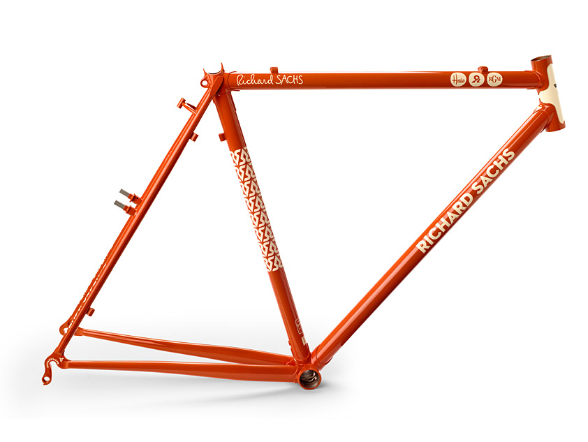
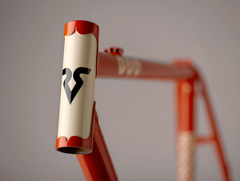
 I hate you for making it look so easy.
I also hate you for giving us hope that one day, graphic design for the bike industry won’t be the macho, gaudy and unholy mess it is today. Thanks. Thanks a lot.
Oh and I see you just worked on a sweet little typographic kit for that rag The New Yorker. You’re trying to kill me right?
Damn you House. Damn you for being so good.
Photos by Carlos Alejandro. (Oh yes, Carlos. I hate you too.)

They had me with orange. How cool is that colour (though being a design firm it probably has some funky name like persimmon). I might be able to enjoy a Winnipeg winter with a persimmon bike 🙂
Holy Jebus.
Great article about a beautiful bike. But Dat Jersey!!!
I’ve watched these guys race every weekend for years and I love what Sachs does and his impact on cross. From a design standpoint, however, instead of red and white they’ve gone a “totally different direction” (their words) to…rust and cream. That’s not a design change, that’s an Instagram filter.
Seriously? Colors are the bike? When does this circus that RS calls “life” become the Walter Mitty sequel: ATMO on a Bike. The “I hate you House” only feeds this whole ego-thing; people it’s a cheap steel frame made by sub-standards, in a fashion which lends to frames that aren’t straight, aligned or pure. Making them orange, with decals on the down tube to “take into consideration the FD clamp” is the stuff of Senior High School graphic design 101.
But they’re red and shiny. Or umm, orange and shiny. And way, way, way overpriced.
Dave, Sounds like you are jealous of Sachs’ skills. And aren’t familiar with fine steel tubing and its use in beautifully constructed bikes. Too bad as you are missing out – steel is real…….